

Q. How do you run a sharing card (OG image) from keyword research all the way through operations?
A card isn't a separate task. Keyword research → page title → SERP check → card production → spreadsheet operations is one pipeline. Design the card itself backward from a 300px sharing card standard, not from a desktop canvas. Keep text out of the image and in metadata; generate only the background scene with AI and add logos and text in code; serve from a public URL; and manage everything as thumbnails in a spreadsheet.
3 lines you can use right now
- Shrink to 300px and check readability first, then scale up from there.
- Don't bake the title into the image, put it in
og:title; use AI for the background, code for the text. - For many pages, fill two spreadsheet columns (scene, copy) and batch-generate; bump
?v=to bust the cache after any change.
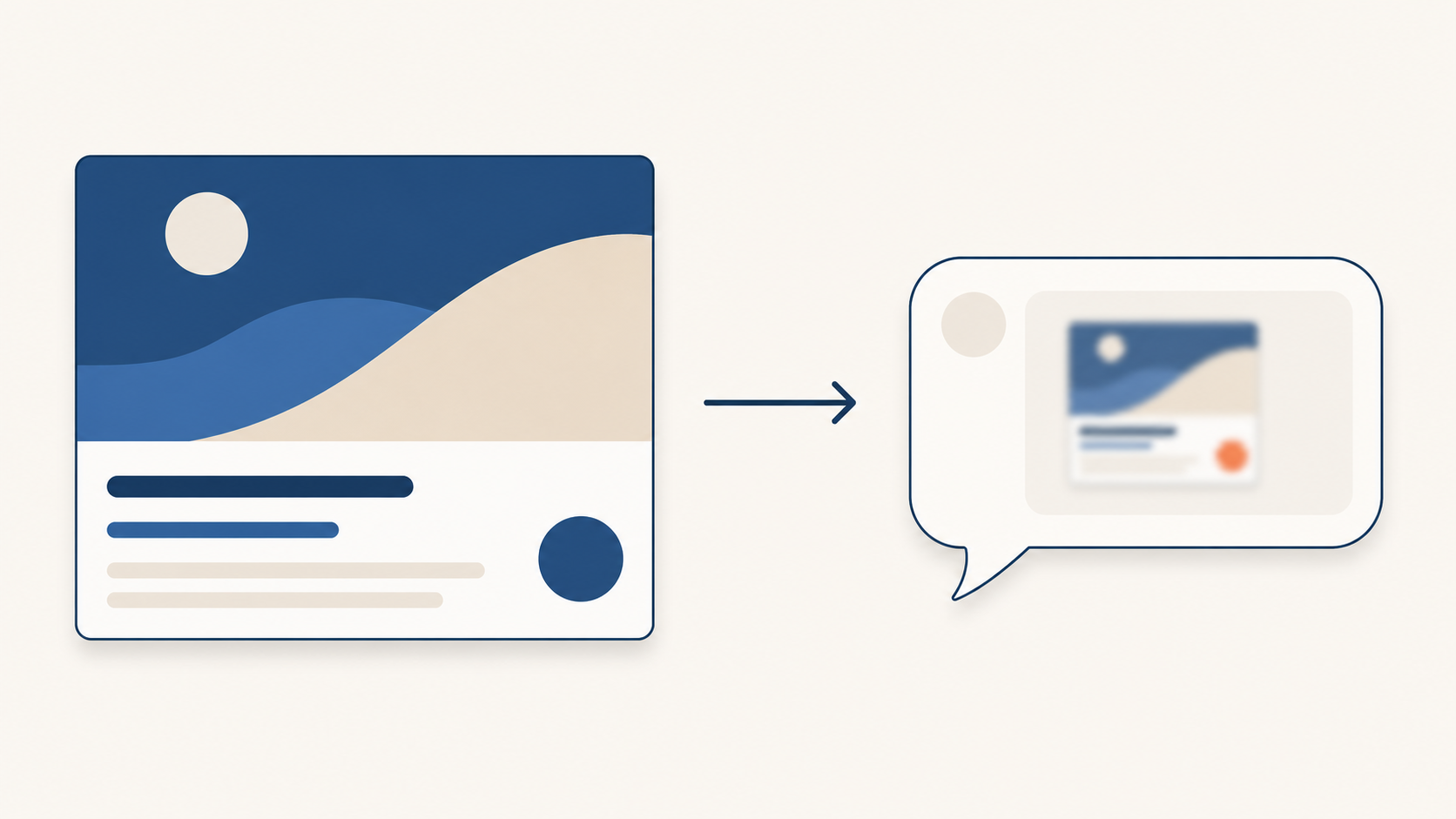
Image: The same graphic looks entirely different at canvas size (1200px) versus as a chat card (~300px). And yet the card is only the end of the chain.
The card is the end of the chain, big picture first
You craft a sharing card, paste the link into a messenger, and a tiny grey blob appears. Common story. But the fix wasn't just the card. The card is the last slot in a chain: what page, optimized for what keyword, with the card as the final click trigger.
So I tied together one telecom and rental comparison site, from keyword research through automatic card generation and through daily operations, as one pipeline. Four stages: choose keywords and write titles (1), verify those pages actually appear in search (2), plan and produce cards that get clicks (3, 4), and run everything from a spreadsheet (5). Principles come out at the friction points along the way.
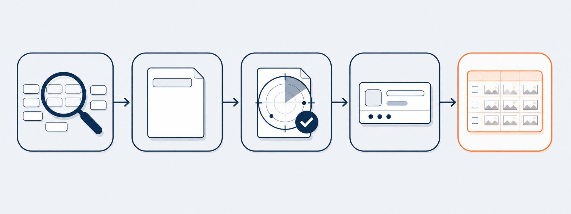
From one keyword to a sharing card, and then to operations. The card is the last link in this chain.
1Choose keywords and write page titles
Once the homepage structure breaks down into individual pages, first look at information architecture (IA) and folder structure. Search visibility is measured at the URL (page) level, so tangled folder structures leak rankings before you even start.
Keywords are measured from three sources rather than guessed: the search advertising API (actual clicks and conversions, demand and intent), data lab (search volume trends and seasonality), and a custom scraper that crawls search results pages (SERPs) directly. The scraper shows who occupies each keyword and in which section (web documents, blogs, shopping).
One judgment call here. Pulling keywords only from ad data skews toward "heavily advertised keywords." In practice, one category captured 87% of the ad-keyword pool. So I also scraped competitor keywords to broaden the scope, then identified gaps (long-tail opportunities) where search volume is high but no strong site holds the top spot.
Selected keywords are assigned to pages as primary and secondary targets. Finally, titles are built by splitting into morphemes. Rather than stuffing "internet sign-up cash rebate" as a single phrase, the term is split into internet, sign-up, cash, rebate and recombined in different orders so one title can match a wide range of search query variations. Search matching breadth beats raw naturalness. Results are stored row-by-row in a spreadsheet, one row per page.
2Automatically check whether those pages actually appear
A well-written title doesn't guarantee visibility. So I built a Python script to check whether my site's pages actually appear in search results for each primary and secondary keyword, and logs the data into the spreadsheet.
The check excludes Naver's own user-generated content (blogs, Q&A) and sponsored reviews, and looks only for the site's own pages in web documents and paid ads. A site's pathways to search are effectively just two: organic web listings and ads. A brand-new domain starting at zero is normal, what matters is trend, not a single-day score.
The lesson from this step carries forward. Title and meta on-page work are necessary but not sufficient. A new site can't quickly break through the web listings dominated by established players. So for now the priority is: once someone lands on the page, make sure they click. That's the card.
3The card, and how the first version disappeared in chat
The last slot before a click, the card. I made one. It looked fine on my monitor. Then I pasted the link into a chat and the text and faces were just a smear. The cause was simple: cards are proofed on a 1200-pixel monitor, but the recipient sees them at roughly 300 pixels wide in a chat bubble. The size you design at and the size people actually see are different.
The math is stark. KakaoTalk (a Korean messaging app) renders sharing cards at roughly 300px wide (this is a measured estimate, not an official figure). An 800px card shrinking to 300px has a scale factor of 0.375. A 24px font at design time becomes 24 × 0.375 = 9px on screen, barely above the 16px readability threshold. To appear at 16px in the card, the design needs to use roughly 43px.
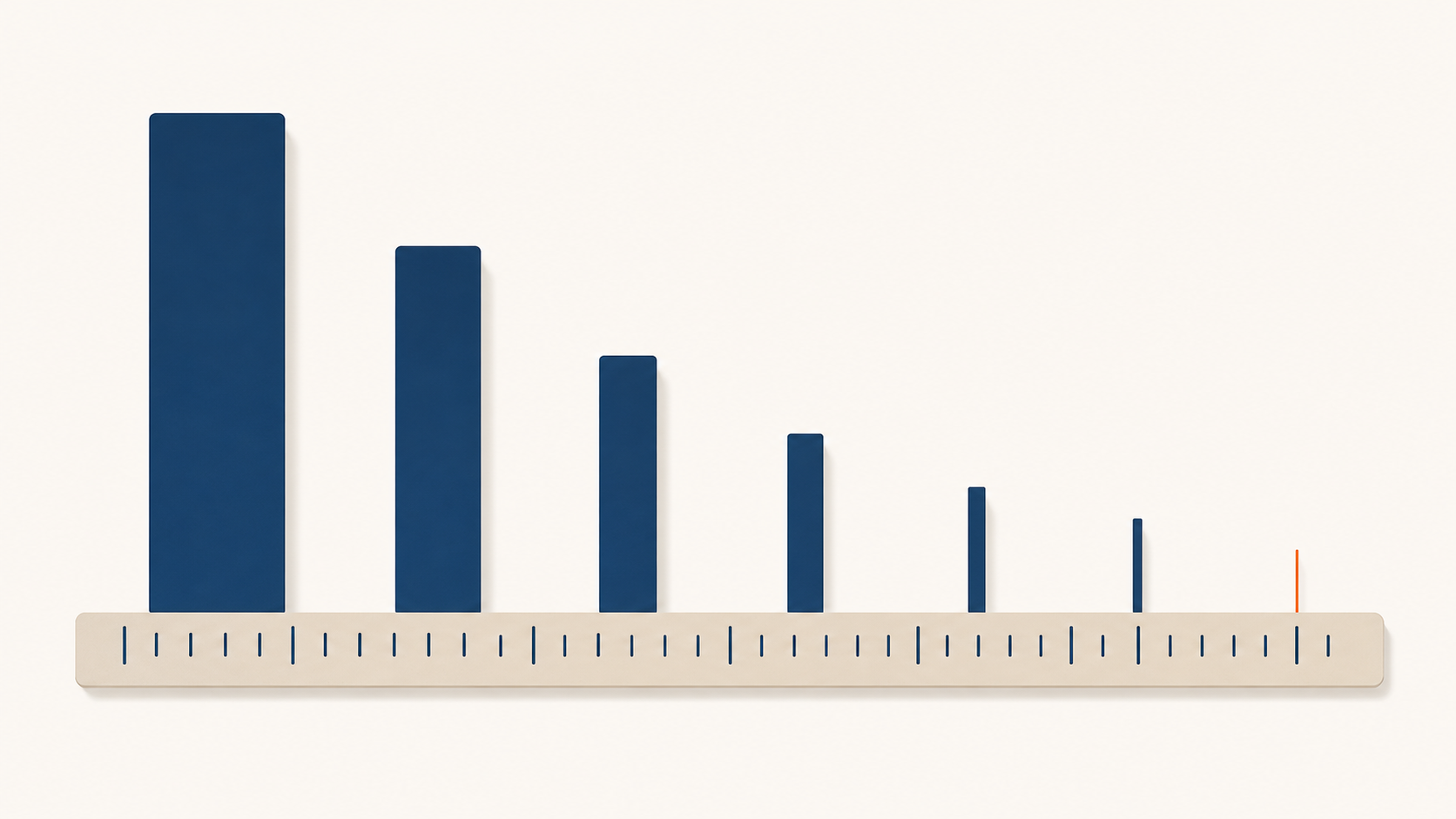
Scale factor 0.375. 24px becomes 9px. For text to be readable in the card, design at 40px or larger.
Making the text bigger just eats the image area. The approach was wrong. Platforms like KakaoTalk and Facebook display the image and the title/description in separate regions, the image card sits above, and og:title / og:description appear as separate text below it. There's no reason to bake the title into the image.
A more decisive reason: text burned into the image is invisible to machines. Facebook's auto alt-text uses object recognition, not OCR, it identifies things in the photo, not letters. If your message must survive, it belongs in metadata. These are just one-line tags placed in the page header, not actual code:
<meta property="og:title" content="Your title here">
<meta property="og:description" content="Your one-line description">
<meta property="og:image" content="https://.../card.png">
<meta property="og:image:width" content="1200">
<meta property="og:image:height" content="630">
The last two lines (width / height) also matter. Declaring dimensions lets crawlers render the image synchronously rather than fetching it asynchronously, preventing the blank-image-on-first-share bug.

Image and title/description live in separate regions. Keep messages in metadata, they stay sharp regardless of how much the image shrinks.
Faces were another trap. Adding a large, smiling person was supposed to build trust, but at small card size it turned into an unidentifiable flesh-colored blob. The issue isn't faces per se. The human visual system locks onto faces extremely quickly, some studies put initial saccades to faces at under 100 milliseconds, and people continued glancing at faces even when instructed to look elsewhere. What matters is direction. People reflexively follow the gaze direction of a face in an image. Studies showed people responded faster in the direction a face was looking, even when told the gaze told them nothing useful. A famous baby-ad demonstration found that a baby facing the camera captured all the attention while ignoring the headline; when the baby turned to look at the headline, headline readership spiked.
So the principle changes. For small cards, enlarge text and crop the subject to a headshot (shoulders and above) rather than a full body. Full body shots are gone, the face becomes too small to have any effect. The face has to be large enough to be recognized for its gaze direction to even register. And point the subject's gaze toward the copy, not the camera.
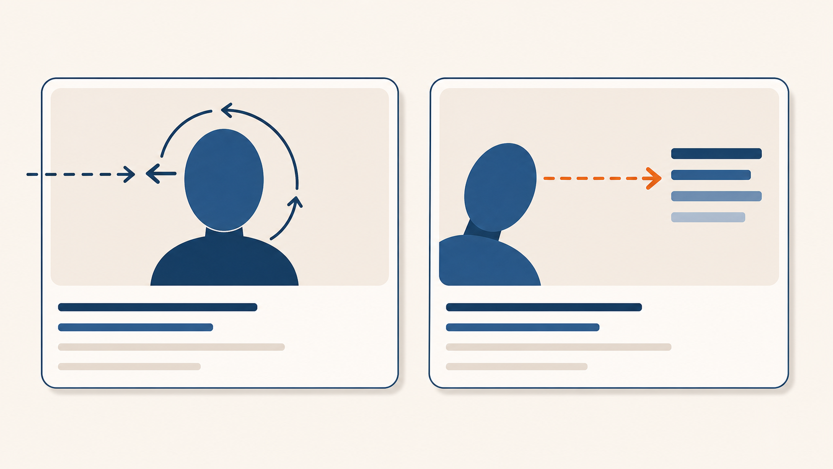
Forward gaze traps the eye on the face. When the subject looks at the copy, the viewer's eye follows.
Last: contrast. Two widely believed rules are already dead. The "20% text rule on Facebook images reduces reach" was retired in September 2020. The claim that "the brain processes images 60,000 times faster than text" has no primary source. The real reason to keep text minimal is readability, not policy.
The number actually worth targeting is luminance contrast. Web accessibility standards set 4.5:1 as a minimum for normal text, but 7:1 is safer for small sharing cards. JPEG compression blurs edges of small colored text, and further scaling means those edges fall on even fewer pixels, dropping real contrast below the design value. Dark (or white) background with black/white text and one accent color is reliable for exactly this reason.

4.5:1 falls below threshold after compression and scaling. Use 7:1 with margin for key text.
Translating these principles into card planning means every decision reduces to three metrics: click-through rate (make them click), bounce rate (don't disappoint expectations after the click), and conversion rate (turn clicks into sign-ups or inquiries). Bounce rate in particular is the real reason to make a different card per page. An iPhone page needs an iPhone; a water purifier rental page needs a water purifier; a FAQ page needs a FAQ screenshot. Reusing one card across all pages causes instant bounces from visitors who see something different from what they expected. So card scenes are typed by URL intent, and hooks are mixed to match that intent.
| Page intent | Hook type | Example |
|---|---|---|
| Informational | Curiosity / question answered | "Wondering about this? Q&A" |
| Benefit-driven | Gifts / discounts | "Benefits, all in one place" |
| Conversion | Quick sign-up / free consultation | "Apply instantly, no waiting" |
| Comparison | Lowest price / recommendation | "Compare the lowest prices" |
| Trust | Real reviews | "Honest reviews from real users" |
4From first concept to final result
Production splits into two for the same reason seen above, don't bake in the text. AI image generators can't reliably render Korean text, logos, or exact pixel dimensions. So only the background scene (models, props, comparison cards) is generated with AI, while logos and Korean text are added in code.
Before generating a background, lock in the image format: subject on the right covering roughly 40%, left side left empty for text, defined margins top and bottom, headshot only (not full body), slight smile, white background with a light accent color. This format is confirmed by generating several concepts in an image tool and selecting with human judgment. The model uses actual brand photos as reference to maintain a consistent face across cards.
Color caused one stumble. The first concept saturated the background with the brand's hot pink and layered fluorescent yellow text. The result looked like a discount flyer. Two high-saturation colors fighting each other read as a clearance sale, not a comparison service. So the ratio was flipped: white background 70%, light pink 20%, deep brand color as 10% accent only. Text in black, one keyword in the accent color. The model was blended softly into the background with a subtle shadow rather than cut out with a hard edge.

Left is the first concept, a flyer. Right is the final card, a comparison service. Same brand color; just flipped the ratio. (Model faces pixelated)
Since baked-in text breaks, the card is built as HTML and converted to PNG. The design lives in an HTML template; page-specific titles and sub-copy are read from a spreadsheet and swapped in; a headless browser (Chrome running without a window) captures the screen and renders a PNG at the exact target dimensions. Korean text is crisp because it uses web fonts. The logo is the real file so it can't be faked. With dozens of pages, filling two spreadsheet columns generates all of them in one run.

Final result. Background from AI, logo and Korean text added in code, rendered at 800×400.
The last piece is hosting. Card images need a public URL for og:image to work. They're pushed to a public GitHub repository and the raw URL goes into og:image. That completes the "making one card" process, the real work is running this across dozens of pages.
5Operations via spreadsheet
Dozens of pages means dozens of cards. Making them one by one by hand collapses quickly. So a single spreadsheet becomes the control tower. Each page is already a row with keywords, title, and meta. The card adds three more columns to that row.
The Scene type column holds the background scene key for that page (by telecom, device, feature, or content type). The Copy column holds the headline and sub-copy in a single cell, using delimiters for line breaks, emphasis, and sub-copy. The Preview column uses =IMAGE with the card's public URL so every page's card is visible as a thumbnail right inside the sheet.
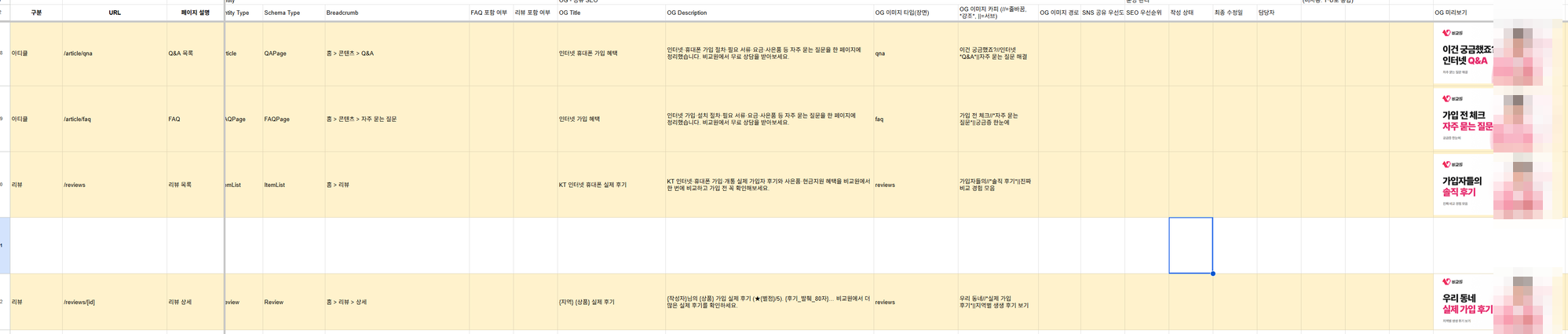
The control tower is a spreadsheet. Per-page scene type, copy, and preview columns; card thumbnails on the right. Only the copy column requires human input. (Model faces pixelated)
Operations simplify. To update copy, change that row's copy cell and run the batch generation script once. Only changed pages get new cards. Humans handle only the copy editing, design, dimensions, logos, and rendering are produced consistently by code.
One trap: uploading a new image but seeing the old card for days in chat. The cache key is the image URL, not the file content. Swapping the file while keeping the same URL means the platform has no idea anything changed. Bump a version number at the end of the URL (?v=2), or force a refresh using Facebook's Sharing Debugger or KakaoTalk's cache reset tool.

The cache key is the URL. Swapping the file without changing the URL changes nothing. Bump the version or re-scrape with the debugger.
Summary: pre-publish checklist
The core is one pipeline. Measure keywords to write titles, verify SERP visibility, design cards backward from the small-screen view, and run operations from a spreadsheet. Check this list before publishing a card.
- Keywords and title: Were keywords sourced from measurements (ads, search volume, SERP)? Were page titles built from morpheme-split keywords?
- SERP visibility: Is the site's page visibility being tracked in the spreadsheet? (Excluding user-generated content and reviews; tracking trends)
- Size and ratio: 1200×630 (or 800×400), are key elements inside the central 80%?
- Text and contrast: Still readable at 300px? Design at 40px or larger, contrast 7:1, copy 2 lines / 15–20 characters?
- Message and dimensions: Was the title kept out of the image and put in
og:title? Arewidthandheightdeclared? - Subject: Headshot instead of full body, gaze toward copy, identifiable at small card size?
- Production and operations: Background from AI / text from code? Can all cards be batch-generated from two spreadsheet columns?
- Hosting and cache: Served from a public URL? After any replacement, did you bump
?v=or bust cache with the debugger?
If you can only remember one thing, make it this:
Don't proof on a big screen. Shrink to 300px, if it's not readable there, that's the real card.
Sources
- Dimensions, 1.91:1, declaring width/height, URL cache, re-scraping: Meta Sharing Images, Best Practices, Webmasters
- og:image attribute: ogp.me
- Auto alt-text (object recognition): Meta Engineering
- X card 2:1 and og fallback: X Cards
- KakaoTalk 2:1 fixed ratio: Kakao devtalk
- 20% text rule retired: Search Engine Journal
- Contrast formula, 4.5:1 / 7:1 rationale: WCAG 2.1 SC 1.4.3
- F-pattern scanning: NN/g
- Saccade to faces at 100ms: Crouzet, Kirchner & Thorpe 2010
- Gaze cueing: Friesen & Kingstone 1998, Frischen 2007
- Unfamiliar faces vulnerable to low resolution: Hancock & Bruce 2000
- "60,000×" myth debunked: PolicyViz
The principles in the first half (9px math, gaze cueing, contrast, cache) were verified against the primary sources listed above. The keyword-to-card-to-operations pipeline is a build record from one actual site following that process (the 87% skew figure and similar measurements are from that real-world data). KakaoTalk render width (~300px) and claims about expressions and trust are marked as estimates or qualitative observations where definitive data wasn't available. Scene types and hook effects on CTR, bounce rate, and conversion are treated as hypotheses to be confirmed through per-channel A/B testing. Model faces appearing in the management view, cards, and before/after images are all pixelated; the before/after images are reconstructed from the actual first concept and final result.
Found this useful? Share it
Latest posts
Kakao Share Thumbnail Not Showing? Here's the Fix (JavaScript SDK 2025)
Learn why Kakao Share thumbnails don't appear even with a valid imageUrl, and fix it using scrapImage to convert your URL into a KAGE CDN URL. Step-by-step guide.
How to Generate CRM User Manuals in 20 Minutes with Claude Code Sub-Agents
Learn how Claude Code sub-agents can analyze your CRM codebase and auto-generate user manuals and visual guidebooks in just 20 minutes. See the real-world results.
GEO Generative Engine Optimization: The Complete 2025 AI Marketing Strategy Guide
Learn what GEO (Generative Engine Optimization) is, how it differs from traditional SEO, and discover 5 proven AI marketing strategies to get cited by AI search engines in 2025.
Related projects
Get new posts by email
Insights on marketing, analytics, and dev, delivered to your inbox.