
Q. My share card (OG image) is unreadable in KakaoTalk (Korea's dominant messenger app). How do I fix it?
Your design canvas is 1200px wide, but KakaoTalk renders chat cards at roughly 300px wide. A headline set at 24px across an 800px-wide card shrinks to 9px on screen, it simply disappears. Use 1200×630 (1.91:1), keep the essentials in the central 80%, pull your title and description out of the image and into og:title and og:description instead, set type at 40px or larger with 7:1 contrast at design time, and crop any portrait to a tight headshot so the viewer's gaze is directed toward the copy.
Three lines you can act on today
- Shrink the image to 300px first and check if it reads, then scale back up from there.
- Don't bake your message into the image pixels; put it in
og:titleandog:descriptionmeta tags (machines cannot read text inside images). - If an old card keeps showing up after an update, it's a URL-keyed cache, use the platform debugger to force a re-scrape.
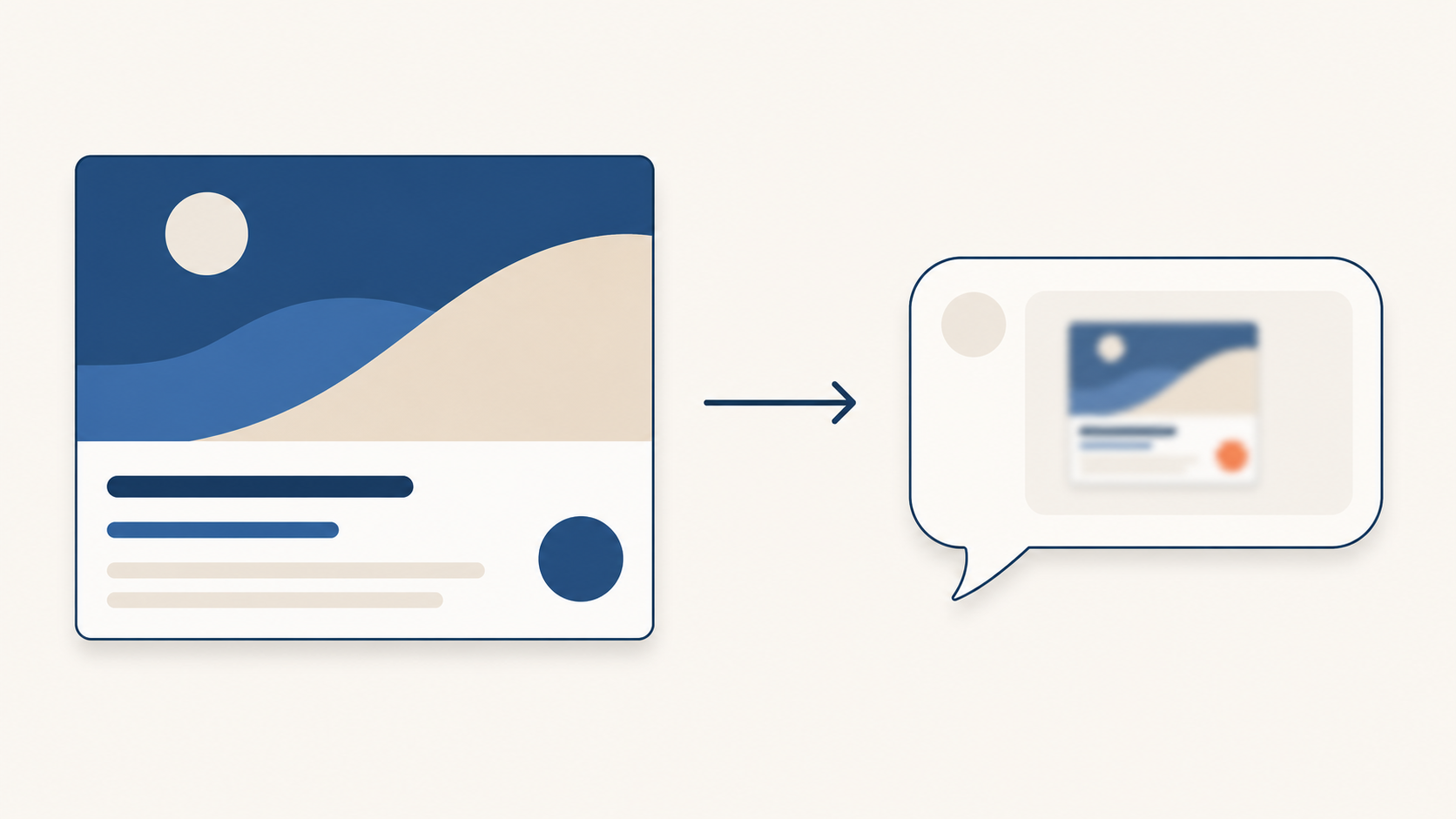
Image: The same graphic looks completely different at canvas size (1200px) versus inside a chat card (roughly 300px).
Inside a Chat Window It Becomes a Blurry Gray Blob
It happens all the time: you carefully design a share card, paste the link into a messenger, and all that appears in the chat window is a tiny gray smudge. The big headline, the portrait, all crushed. Same file, so why?
The reason is straightforward. Cards are usually proofed on a monitor at 1200 pixels wide, but the recipient sees them in a chat bubble roughly 300 pixels wide. The size you design at and the size people see are different.
That means an OG image should be designed not as "a beautiful big picture" but as "a picture that survives being shrunk." The rules below are drawn from official documentation and published research.
Canvas 1200, Screen 300, Therefore 9px
A quick definition first. An OG (Open Graph) image is the preview card that appears when you paste a link into a messenger or social platform. Facebook created the specification, and today virtually every service reads it, KakaoTalk, X, Slack, iMessage, and more.
The trap is the scale factor. KakaoTalk chat cards are rendered at approximately 300px wide on most devices (this is an empirical estimate, not an official figure, Kakao does not publish its render width). A card designed at 800px wide that gets displayed at 300px is scaled by a factor of 0.375.
Do the math. A 24px headline at design time becomes 24 × 0.375 = 9px on screen. That is just barely above half the 16px threshold commonly cited as the minimum for comfortable reading. No wonder it disappears. To read as 16px inside the card, a headline must be set at roughly 43px at design time.
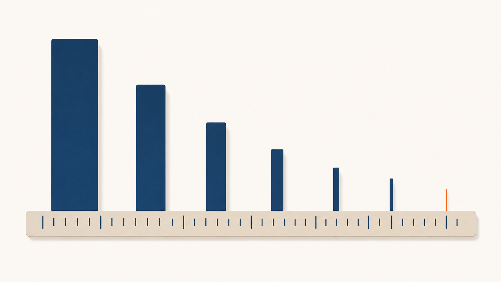
Scale factor 0.375. 24px becomes 9px. To be legible in the card, set type at 40px or larger at design time.
Size is not the only issue. People don't read small cards, they scan them. Nielsen Norman Group's eye-tracking research (232 participants) found that users do not read word by word; they sweep in an F-shaped pattern. The key takeaway: "the first two paragraphs" get the most attention, and information-carrying words should come first.
A small preview card gets less than a second of attention. If you design on the assumption that it will be read carefully, the whole thing gets ignored. That's why you have to design in reverse: bigger type, a single message, the core content centered.
Don't Bake Text Into the Image, Machines Can't Read It
Making the type bigger sounds like the fix, but the more you scale it up, the less room there is for anything else. The premise is wrong to begin with.
Platforms like KakaoTalk and Facebook display the image and the title/description in separate zones. Below the image card, og:title and og:description appear as distinct text. There is no reason to burn the headline into the image pixels. Move it to meta tags and that text stays sharp regardless of how much the image is compressed or scaled.
There is a more decisive reason. Text baked into an image is invisible to machines. Facebook's automatic alt-text system uses object recognition to identify things in photos, it is not OCR. Numbers and headlines inside an image are invisible to screen reader users and to any preview renderer that only pulls text. If your message needs to be understood, it must live in the meta tags.
Don't be put off by how it looks like code. It's just a few label lines in the page head.
<meta property="og:title" content="Your title here">
<meta property="og:description" content="Your one-line description here">
<meta property="og:image" content="https://.../card.png">
<meta property="og:image:width" content="1200">
<meta property="og:image:height" content="630">
The last two lines (width and height) matter too. Meta's documentation states that declaring dimensions in advance lets the crawler "render immediately without fetching and re-measuring the image asynchronously." Leave them out and the image may appear blank on first share, a common symptom.

The image and the title/description occupy different zones. Put the message in meta tags, it stays sharp regardless of image scaling.
You Updated the Image but the Old Card Keeps Showing
You upload a new image and the chat window still shows the old card days later. Clearing your browser cache makes no difference. This is not a bug, it is how the system is designed.
One line from Meta's documentation explains it: "Images are cached by URL, and changing only the file without changing the URL will not trigger an update." The cache key is not the file, it is the image address. Swap out the file at the same URL and the platform has no idea anything changed.
You have two options. Change the image URL (for example, append ?v=2 to the end), or force a re-scrape. For Facebook, paste the URL into Sharing Debugger and click "Scrape Again." For Kakao, use the Cache Reset option in their developer tools. The official cache expiry is 24 hours, so the card will eventually update on its own, but if you need it now, use the debugger.
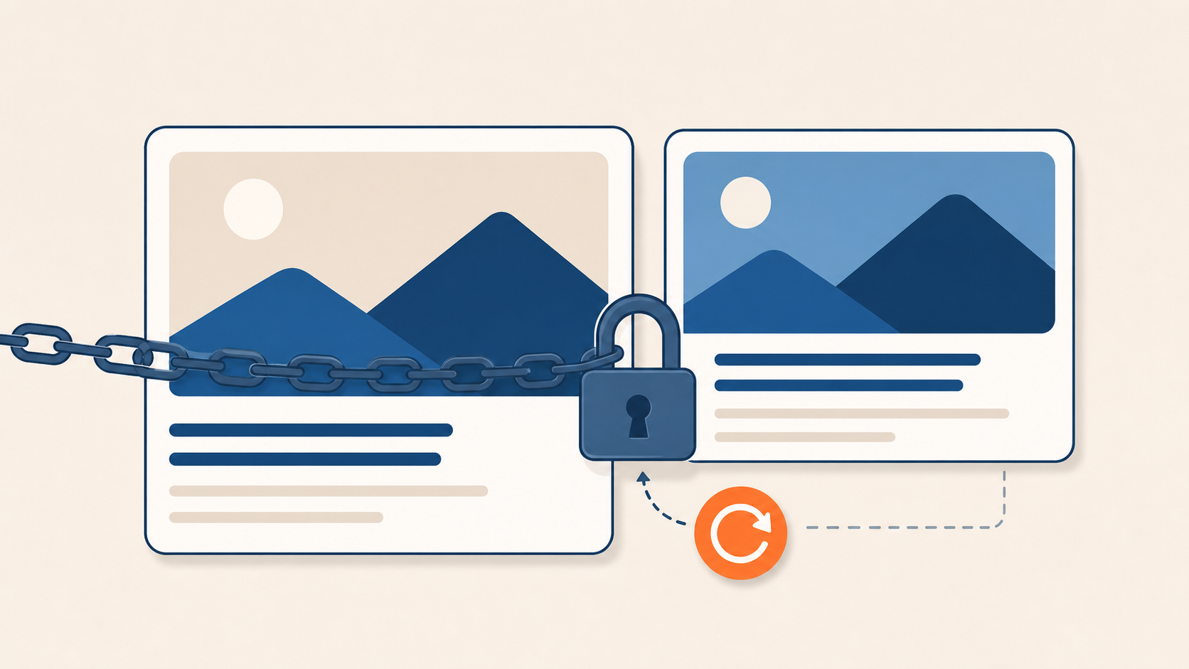
The cache key is the URL. Changing only the file doesn't trigger an update. Re-scrape via debugger or change the URL.
Why a Large Portrait Backfires, and How Gaze Direction Works
Portraits are said to build trust. So a large, smiling face seems like a smart addition to a card, but at small card sizes, it has the opposite effect. Instead of a trust signal, the face becomes an unidentifiable flesh-colored blur.
The face itself is not the problem. The human visual system locks onto faces with extraordinary speed. In one experiment, eye movements toward a face began as quickly as 100 milliseconds (140ms on average), and even when participants were told to look for a vehicle, their gaze still pulled toward faces involuntarily. In a study using electrodes on the brain, the face-processing region responded within 50–75 milliseconds of stimulus onset. In short: if there is a face in the card, that is where the viewer looks first. The problem arises when that face is not identifiable. Research on face recognition confirms that unfamiliar faces are especially vulnerable to low resolution.
There is a deeper principle at work here. People reflexively follow the gaze direction of a face in an image. A 1998 experiment showed that even after participants were explicitly told that the gaze direction did not predict the correct target location, they still responded faster to targets on the side the face was looking toward. The following is reflexive, not deliberate.
A well-known eye-tracking demonstration makes this vivid. In a baby product ad, when the baby looked directly at the camera, viewers focused on the baby's face and largely ignored the copy. When the baby's head was turned so it appeared to look toward the headline, readership of the headline rose sharply. Where you point the face determines where the eye travels next.
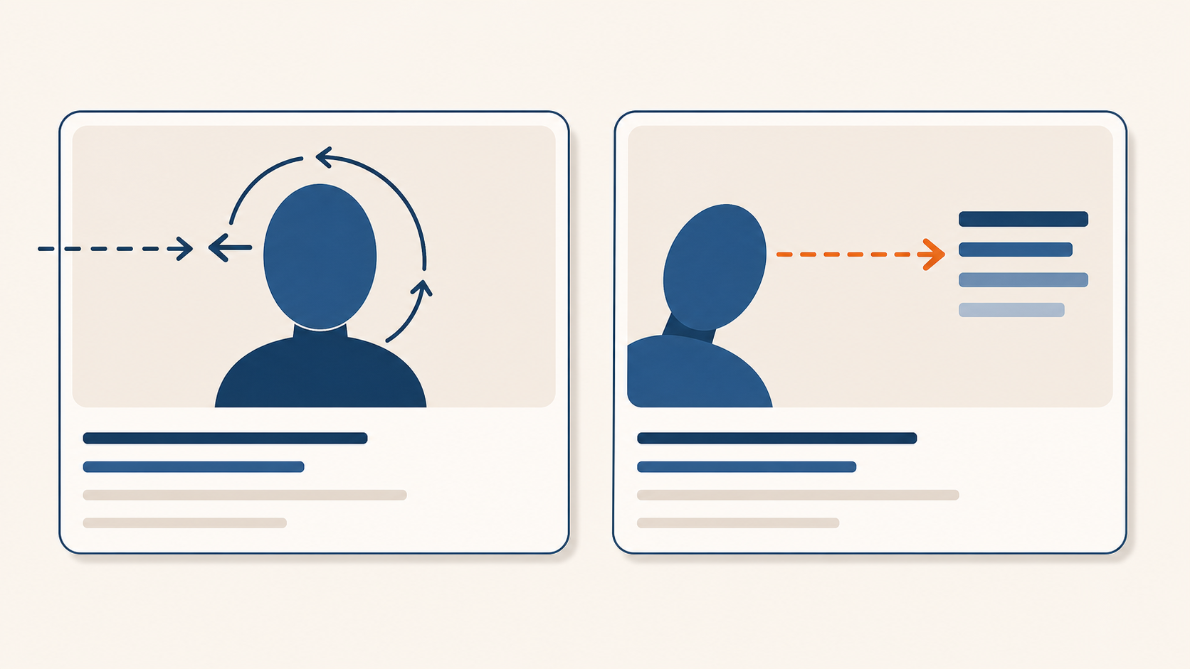
A direct stare traps the viewer's gaze on the face. Turn the portrait toward the copy, and the viewer's eye follows there too.
The principle that follows: the smaller the card, the larger the type should be, and any portrait should be cropped to a tight headshot used as a supporting element, not a full body shot, which loses all its effect at small sizes. This one change solves two problems simultaneously: a larger face is more identifiable at low resolution, and a clearly identifiable face can actually direct gaze. Point the subject's gaze toward the copy, not the camera. Note that the gaze-cueing evidence comes from lab settings and large-format ads; applying it to palm-sized cards is a reasonable inference, not a guaranteed rule. When you need to include a person, there are three layouts to consider.
Corner cutout is the most practical: text occupies 70% of the left or top area, a headshot sits in a corner. Overlay uses the portrait as a darkened background and places large type on top, giving you 100% of the card for readability. Vertical split divides the card with text on the left and a vertically cropped headshot on the right. On expression: a genuine smile tends to improve perceived trustworthiness, and research suggests that impression forms within 100 milliseconds, though a fake smile (eyes not engaged) can actually erode trust, so no strong claim is made here.
Two Rules People Follow That Are Already Wrong
There is one rule that holds a lot of people back: "Facebook penalizes reach if more than 20% of an ad image is covered in text." That fear keeps people from putting enough type on their cards.
That rule was retired in September 2020. Meta dropped the 20% text rule for ad images and took down the checking tool along with it. There is no penalty today. All that remains is a gentle recommendation that less text tends to perform better. In other words, the real reason to limit text on an image is legibility, not policy. Confusing the two ties your hands in the wrong place.
Another line gets quoted constantly: "The brain processes images 60,000 times faster than text." Follow the citation trail and you find no source. The figure circulated through marketing materials without any original study attached, and everyone who has tried to trace it back has come up empty. Do not cite it. If you want to convey that images are processed quickly, use a real data point, like the 100ms face detection figure cited above.
The number that actually matters is contrast. The Web Content Accessibility Guidelines (WCAG) set 4.5:1 as the minimum for normal body text and 3:1 for large text and graphics. The 4.5 figure has a documented basis: minimum normal vision requires 3:1, but visual acuity at 20/40 (a common level of degraded vision) reduces contrast sensitivity by roughly 1.5×, giving 3 × 1.5 = 4.5.
For small cards, aim for 7:1 to be safe. JPEG compression stores color information at half resolution, which blurs the edges of small colored letterforms, and scaling further reduces the effective contrast below the design value. Hitting exactly 4.5 at design time often means missing it inside the card. Dark background, white type, one accent color is the most reliable combination for a reason, it clears 7:1 without effort.

A designed 4.5:1 ratio falls below the threshold after compression and scaling. For key copy, build in a margin and target 7:1.
Checklist Before You Export
One sentence covers everything: design in reverse from the shrunken card, not from the monitor; pull text into meta tags; point gaze toward the copy; and bust the cache after any update. Run through this list before you export.
- Size and ratio: Is it a single image at 1200×630 (1.91:1)? Is the core content within the central 80%, with roughly 5% clear on each edge? (KakaoTalk and X crop slightly tighter at 2:1)
- Type size: Does it still read when shrunk to 300px? Is the headline 40px or larger at design size, with copy no longer than 2 lines or 15–20 characters?
- Contrast: Is the key copy at 7:1 or better? (Account for compression and scaling loss)
- Message placement: Is the title/description in
og:titleandog:description, not baked into the image? Does the image carry only visual content? - Dimension declaration: Are
og:image:widthandheightset so the card renders immediately on first scrape? - Portrait: Is it a tight headshot rather than a full body shot? Does the gaze point toward the copy? Is the face identifiable at small card size? If not, replaced with a logo?
- File: JPG or PNG, under 8MB (X requires under 5MB)? Under 1MB is safest in practice.
- Cache check: After swapping the image, did you clear the cache via the Facebook and Kakao debuggers and verify by pasting the link into an actual chat window?
If you can only remember one thing, make it this:
Don't proof it on your monitor. If it doesn't read at 300px, that is what it actually looks like.
Sources and References
Size, 1.91:1, dimension declaration, URL caching, re-scraping: Meta Sharing Images, Best Practices, Webmasters. · og:image property: ogp.me. · Automatic alt text (object recognition): Meta Engineering. · X card 2:1 / og fallback: X Cards. · Kakao 2:1 fixed crop: Kakao devtalk. · 20% text rule removed: Search Engine Journal.
Contrast formula, 4.5:1 / 7:1 basis: WCAG 2.1 SC 1.4.3. · Scan behavior, F-pattern: NN/g. · Face saccade at 100ms: Crouzet, Kirchner & Thorpe 2010. · FFA response at 50–75ms: Ghuman 2014. · Gaze cueing: Friesen & Kingstone 1998, Frischen 2007. · 100ms trust impression: Willis & Todorov 2006. · Unfamiliar faces at low resolution: Hancock & Bruce 2000. · "60,000x" myth debunked: PolicyViz.
This post is an explanatory guide compiled from primary sources via web research (not a first-person account of personal experience). All figures are verified against the sources listed above. Estimates that could not be confirmed, such as Kakao's render width (~300px) and the relationship between facial expression and trustworthiness, are marked as estimates or qualitative observations. Any click-through or conversion effects should be validated through channel-specific A/B tests; no unsourced CTR multipliers are cited here.
Found this useful? Share it
Latest posts
Kakao Share Thumbnail Not Showing? Here's the Fix (JavaScript SDK 2025)
Learn why Kakao Share thumbnails don't appear even with a valid imageUrl, and fix it using scrapImage to convert your URL into a KAGE CDN URL. Step-by-step guide.
How to Generate CRM User Manuals in 20 Minutes with Claude Code Sub-Agents
Learn how Claude Code sub-agents can analyze your CRM codebase and auto-generate user manuals and visual guidebooks in just 20 minutes. See the real-world results.
GEO Generative Engine Optimization: The Complete 2025 AI Marketing Strategy Guide
Learn what GEO (Generative Engine Optimization) is, how it differs from traditional SEO, and discover 5 proven AI marketing strategies to get cited by AI search engines in 2025.
Related projects
Get new posts by email
Insights on marketing, analytics, and dev, delivered to your inbox.